

Claude Type, From Zero
One month later, I’m ready to tell you the behind-the-scenes story of how this couture type atelier came to life: thoughts, process, and costs.

One month after the launch, I finally feel ready to share what it truly meant to build my own little couture atelier for typography, three years of process, thoughts, and investment.
For the past seven years, I’ve been selling my typefaces (Romie, Ninna, and Kalice) on my personal website, under my own name. I actually began typography while I was still a student. At the time, I had completely different dreams. I imagined myself working in fashion or advertising. I pictured a life in PR, or maybe as an art director for a luxury house, shaping images and stories for beautiful brands.
But life had other plans.
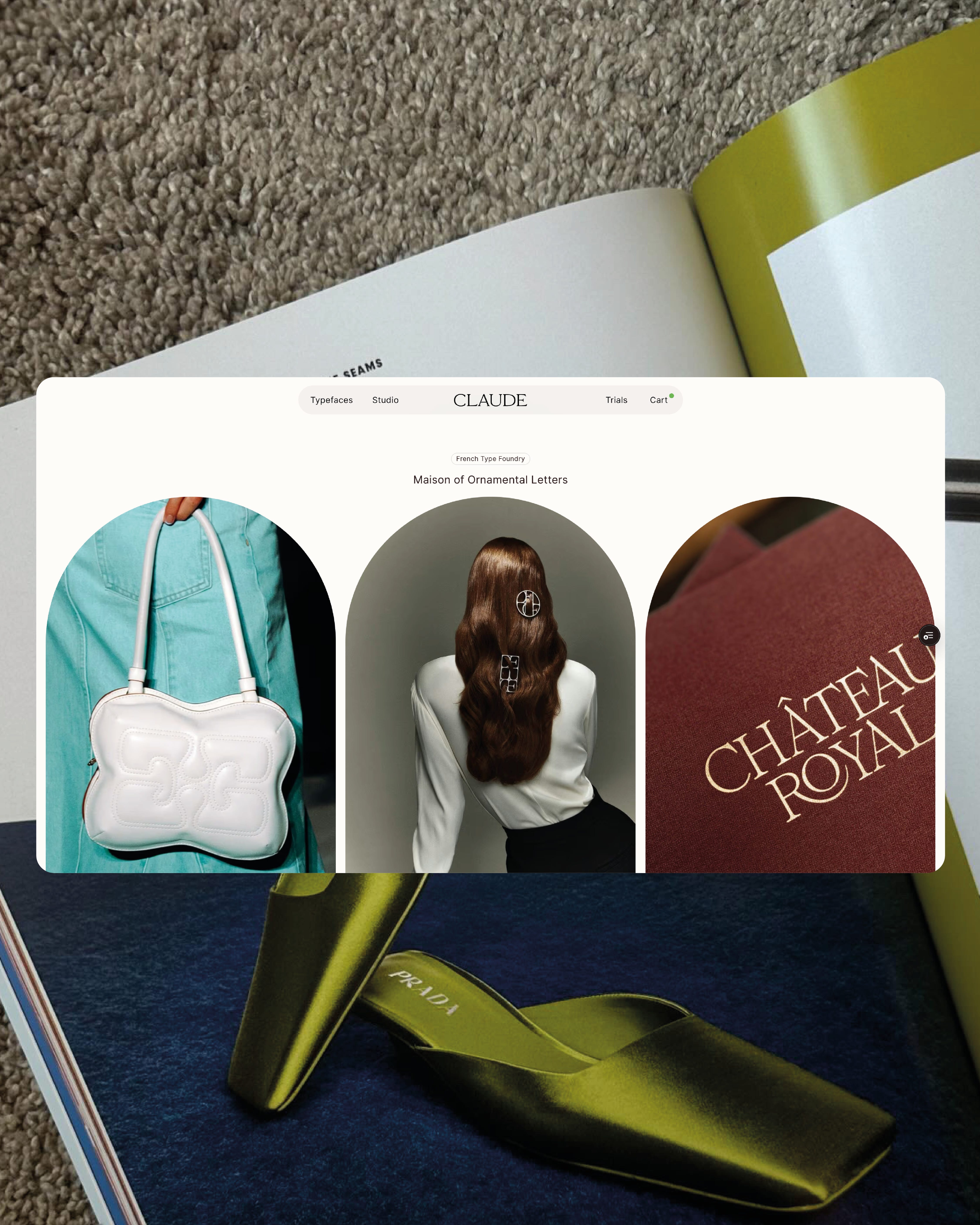
On January 26, 2026, at exactly 6:14 pm, while the streets of New York were freezing and the wind chill made it feel like -30°C; I released Claude Type, the type foundry I have been quietly building for three years.
I discovered typography almost by accident, during an art direction master’s degree I hadn’t even wanted to pursue. What was supposed to be a simple path toward graphic design slowly turned into something much softer and deeper, a quiet love for drawing letters; especially the curved ones.
Little by little, as I immersed myself in type design, I began to feel it settling inside me. It was no longer just something I was learning. It was becoming part of who I am. Drawing became essential to me. It feels therapeutic, grounding, almost gently liberating. My fonts have always felt awkward to some and powerful to others, but to me they are simply necessary.
When I feel sad, I draw.
When I feel happy, I draw.
When I doubt myself, I draw.
I can spend four days on a single letter without anyone knowing, gently adjusting a curve by a millimeter, almost breathing with it. That’s how my typefaces come to life.


To create, I truly need solitude. Some of my very best swash ideas have come while I was in bed, wrapped up in my own little world, half dreaming, half drawing. The office is for meetings, for structure, for bigger conversations. But when I draw, I need softness. I need stillness. I need quiet.
Through my bespoke typefaces, I’ve had the chance to collaborate with many fashion houses. And yet, almost every time, I had to fight to be credited, and most of the time, it simply never happened. To read more about this topic, I shared more in my interview with The Brand Identity.
That frustration quietly shaped my vision.
I truly want typography to stand beside fashion, photography, and art, with the same visibility and the same respect.
Whenever I visited the websites of type designers I deeply admire, I couldn’t quite find myself there. Everything was beautifully done, thoughtful, impressive, yet not fully aligned with my own sensitivity. I felt a gentle but persistent urge to add my own touch. Not someone else’s.
Mine.
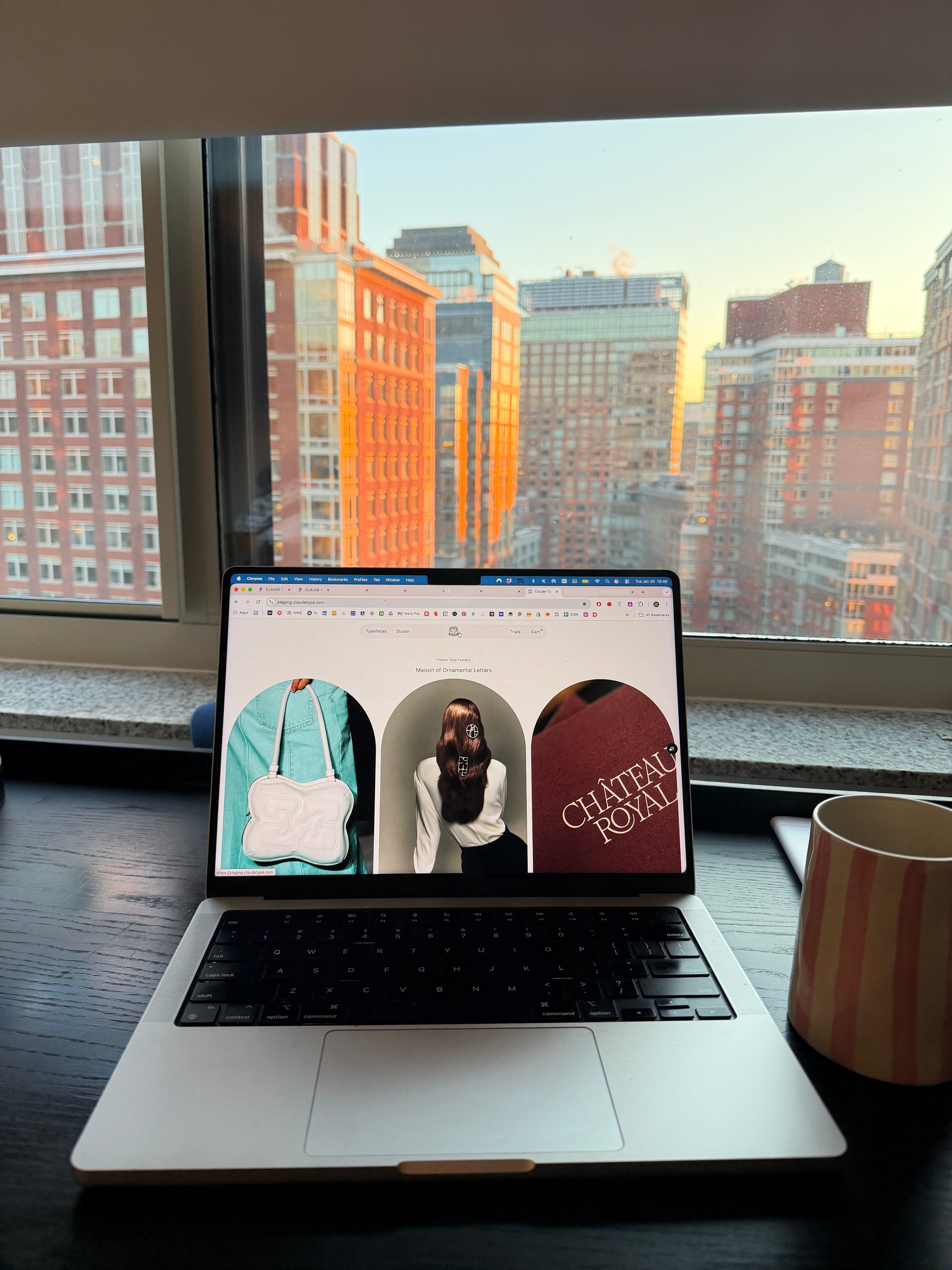
I’m incredibly grateful to have worked with International Magic, true masters of web and digital design. They helped shape, in digital form, what I had been carrying in my mind for so long. Then 27Bureau (with special thanks to Paul Bouisset) developed the website with such patience and precision. I truly couldn’t be happier with the result.
I can’t stop remembering six years ago (already) when I was a student in Paris, wandering through old bookstores every week, sometimes several times a week. I would stand in awe in front of antique type specimens and feel the same quiet urge every single time: “I need to redraw this, it’s too beautiful”. And after years of designing typefaces, I realized they needed a proper home. Around the table, there is space that keeps growing. A seat for for Romie, Kalice, Ninna, and for all the future guests who will join them. Claude is the host. Ernest is arriving soon, bringing dessert.


There was a moment when I almost gave up, especially when Claude AI was released. I even changed the name of the foundry for nearly a year. But nothing ever felt quite right. This tribute had been sincere from the very beginning. And besides, Claude is, first and foremost, a French name.
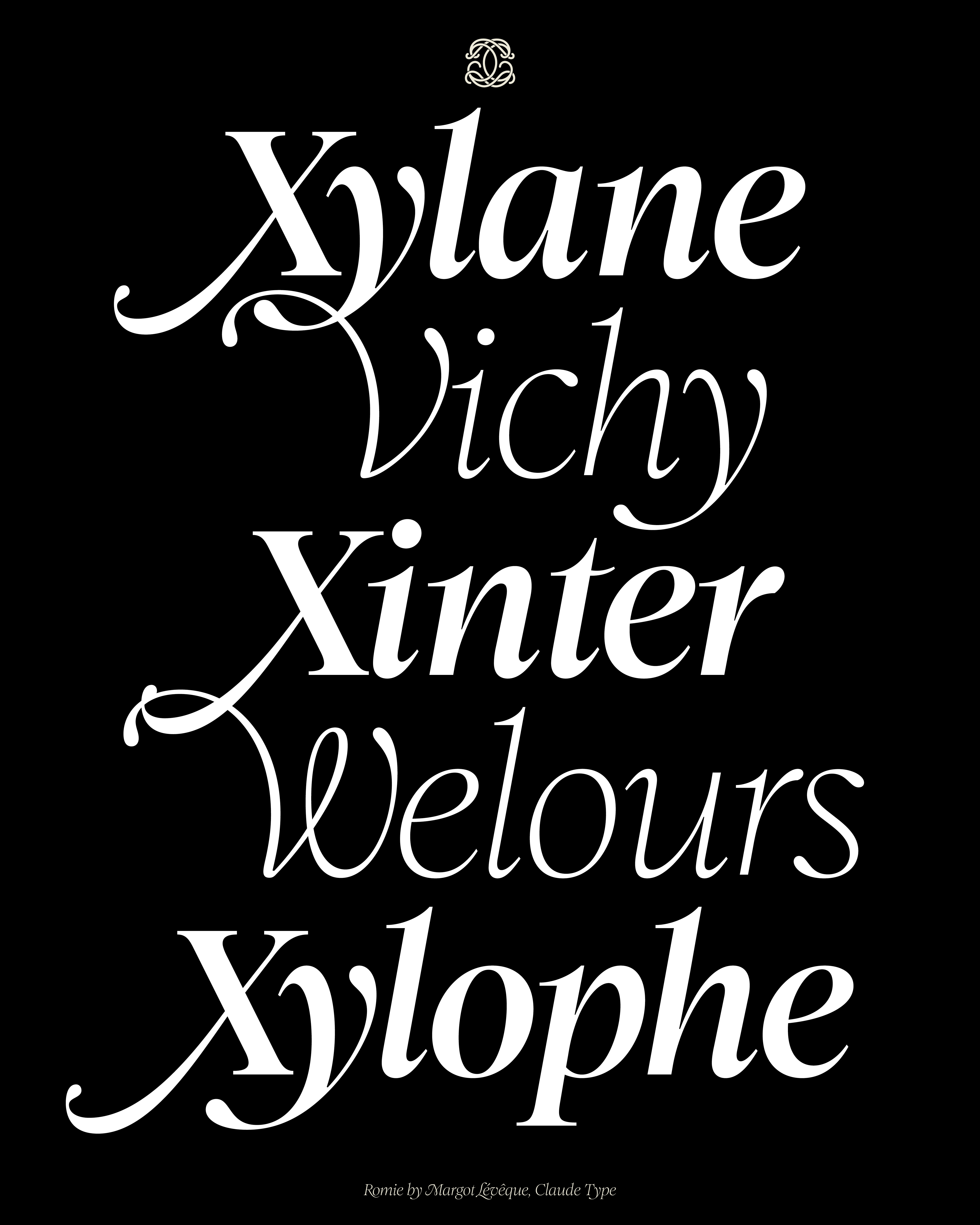
Claude Type is a tribute to Claude Garamont. As a student, I returned to Garamond again and again. I wanted to come closer to that heritage, to gently reshape it, to let my own voice exist within it. That is how Romie was born.
Claude is also a tribute to my grandmother, Claudine, the woman who quietly taught me what elegance truly means. A certain old French chic. Subtle. Timeless. How effortlessly chic is she? I could never do better.


Over the years, I have experienced beautiful highs. Prestigious brands choosing my typefaces, extraordinary commissions, inspiring encounters that felt almost unreal. And there was also the other side. Repeated copying. Legal battles. Moments that felt heavy.
For a long time, I struggled to separate myself from my work. My intentions were always pure, and I took plagiarism very personally. I stopped speaking about it publicly and chose instead to handle things legally :) It is far more common than people think. Foundries simply do not talk about it.
Still, all of it drained me.
But what better protection than a man’s name in a man’s world? Although, of course, Claude can also be a woman’s name.
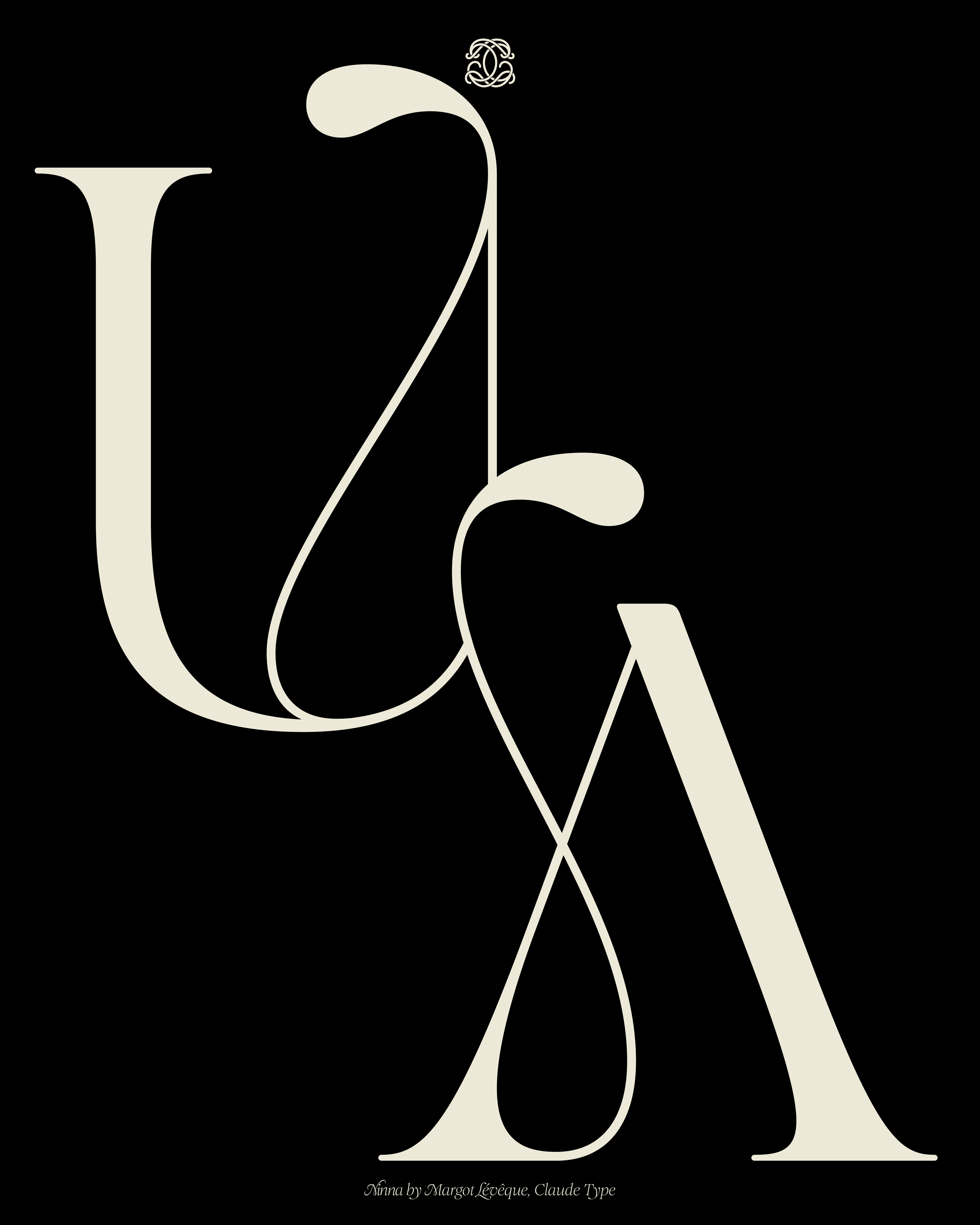
It took me years to truly understand what a type foundry meant to me. To me, it feels like haute couture. I see myself as a première d’atelier, spending hours not on a dress, but on a single letter. Romie took seven years to create. Kalice and Ninna between three and four each. I take my time because I genuinely love taking time.
I don’t know how long this will last. AI is moving fast, and none of us really knows what the future holds. But what I do know is this. I draw letters because I love drawing them. It is more than a passion. It feels therapeutic, almost like a way of grounding myself when everything else moves too quickly.
My inspirations come from decades ago, sometimes centuries ago. I feel deeply nostalgic for old French beauty, for its elegance and restraint, and at the same time I still crave modernity, movement, and fire. I live somewhere between heritage and instinct.


While all of this was happening quietly in my little cocoon seven years ago, something else was happening outside. Year after year, the demand for my fonts kept growing. And the funny part is that at the beginning, I did not even know what an OTF file was. I knew nothing about how digital type worked, how to sell files, how to build a business around it. I learned everything along the way. I was not ready. I am still not completely ready. But I grow a little more each time. We really do learn by doing.
As the requests increased, many established foundries offered to distribute my fonts. It was generous and tempting. But deep down, I always wanted my own small space in this vast typographic world. A quiet place. No oversized catalogue. Just a few typefaces made with care, intention, and time, like a couture atelier where a single dress can take years to complete.
Little by little, I started saving. Quietly, patiently. Over the years, I put money aside with one idea in mind, to reinvest it into this website. I knew web development was expensive, but I wanted something lasting. Something that truly feels like me. Something steady.
I graduated in 2019 and have never received a salary. I have never been employed by a company. After my final internship at Pentagram in New York, I returned to Paris and remained a freelancer. I had no financial pretensions at the beginning. I said yes to every project. My goal was to build my portfolio first, to make it so strong that later I could confidently ask for higher fees. Every project was a chance to learn, to grow, to move forward to this:
I knew that without a strong portfolio, I couldn’t ask for higher daily fees. So I tried to focus on the work itself. To make it better. More consistent. More precise. I trusted that if the work grew, everything else would slowly grow with it. So I stayed patient. I invested in the work first, even when it felt invisible. I did not rush. I just kept going.
I’m not here to give lessons. I’m still learning every day. But for me, building something solid before expecting it to pay off felt like the most honest way to move forward.
And because this space is built on honesty, I want to share the numbers with you.
Between the development of the website, the hosting, and the designers I collaborated with over three years, including early attempts that did not work out because nothing ever unfolds perfectly when you build something from scratch, the total cost came to